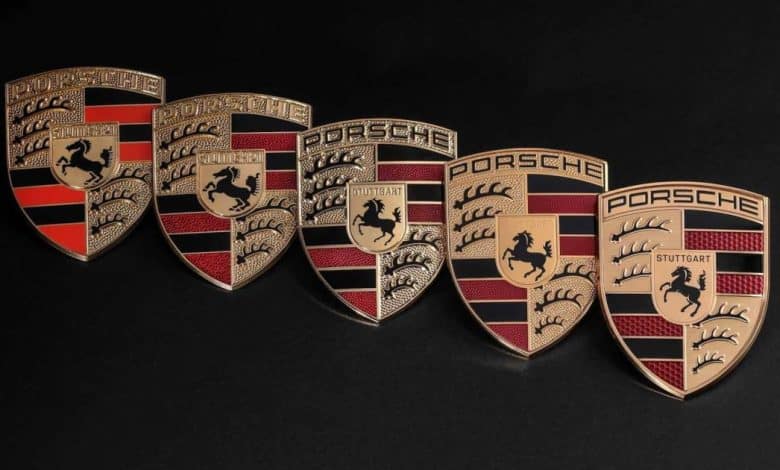
Porsche makes a slight logo change

The crest of a car manufacturer is an important element for the brand. In fact, the badges allow the various manufacturers to position themselves in the automobile market and to help motorists to associate the right vehicle with the right brand. Pledge of confidence, pledge of innovation or pledge of quality, car manufacturers usually keep their badges for a very long time so as not to create confusion.
On the other hand, in recent years, it is now common to see manufacturers renewing their brand image. Technological transition is singled out in this image redesign, and this is also the case with Porsche which, despite very subtle changes, officially unveils a new crest.
Minor changes
It is without fireworks or big event that Porsche announced the arrival of its new badge. At first glance, the design revisions are inconspicuous, but the sports car manufacturer mentions that it still took 3 years to finalize the brand new design.

Although subtle, the logo nevertheless sports a few new elements. First, Porsche confirms that the badge is more sophisticated compared to the old one. Still in the same shape and dyed color, the coat of arms is now finished in smoother brushed metal, has a honeycomb structure in the red sections reminiscent of a honeycomb, and the name of the city of Stuttgart, place of production of the brand vehicles, has again been added to the heart of the crest.
This addition is, in effect, a callback to the company’s later crests, as prior to the logo’s renewal in 2008, each alteration bore the name of the manufacturer’s production city at the heart of the emblem. The emblem is therefore a perfect mix between history and the vision of the future of the automobile in the eyes of Porsche.

A modified logo for a 6e time
At first, Porsche produced vehicles without having an official crest. Before 1952, Porsche cars were identified by the name of the manufacturer in letters. It took 4 years for the company to find a coat of arms that lived up to its expectations. Designed by the same engineer and technical designer who created the Volkswagen emblem, Franz Xavier Reimspieß, the Porsche logo was an amalgamation of elements that recalled the origins of the manufacturer.
Introduced in 1952, the Porsche coat of arms already displayed the rearing horse, which evoked the seal of Stuttgart. The logo was therefore red, gold and black, colors that came from the coat of arms of the state of Württemberg-Hohenzollern. During the 6 different evolutions of the crest, that is in 1954, in 1963, in 1973, in 1994, in 2008 and in 2023, these same basic elements remained almost unchanged. Precisely, the new emblem of the company retains all of its elements.
This means that the crest of the German manufacturer is in continuity rather than change. Emblem update coincides with 75e anniversary of the brand, scheduled for June 8. The brand’s vehicles will begin to display this new logo from the end of 2023. Moreover, for those less convinced of this new style, the manufacturer offers, as an option, to replace the crest with one of your choice among the 5 other brand logos.


